I’ve always loved comics. My father would come home from his job with a surprise stack of comics sometimes. I would vibrate with anticipation on which one I would read first. They were cooler than most movies. They were light years better than any television show. And...
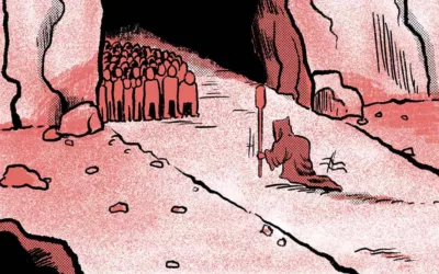
The Black & White Boom And How It’s Still Inspiring Me
read more